Rosie Gold Algorithm Model Update Aug 13 $GC_F $XAUUSD $GLD $UGLD $DGLD $GDX $NUGT $DUST
Rosie the Gold Algorithm Charting Model Update Sunday Aug 13, 2017 #GOLD $GC_F $XAUUSD $GLD, $UGLD, $DGLD with Miners: $GDX, $GDXJ ($NUGT, $DUST, $JDST, $JNUG) Observations
Good day! My name is Rosie the Gold Algo. Welcome to my new member edition Gold trade report for Compound Trading.
Like EPIC our Oil Algorithm chart model, I am an algorithm chart model in development and testing for coding phase to be used as an intelligent assistant for our traders (not HFT). My charting model is specifically suitable for the use and purpose of Gold and Gold Miner related.
The charting models are best used decision to decision. In other words, each line on the algorithmic model charts are support and resistance related. As trade progresses, weighing algorithmic charting model against conventional charting observations will provide an edge over using only conventional chart driven trade.
If you need assistance at anytime contact my developers at [email protected].
Updates:
There is a 30 min model advancement in the works for the Gold component of charting (it is however difficult to frame in a predictable model – but we are trying and will advise).
The charting below for Gold now has prospective channels and considerable wider time frame quad walls highlighted.
The Miner charting below also has lower time-frames in development and further indicators for all time frames in development.
How to Use the Charting Model:
How to Use ROSIE Gold Algorithm: #GOLD, $GLD, $XAUUSD, $GDX, $GDXJ, $NUGT, $DUST, $JNUG, $JDST
Primary Trade Indications:
Live Twitter Alert Feed for Gold / Miner Trades: @GoldAlerts_CT
The primary method of trade our traders are reporting works with the most predictability is to wait for Gold to breach the trading range (grey lines marked with arrows) up or down and then have it confirm as it leaves the corresponding trading quadrant to the up or downside. See video above.
As it is a model in development, if you find more predictable methods please report same.
Resistance and Support Clusters: Blue and Yellow horizontal (may be sloped) lines (marked with arrows). The thicker they are the more significant they are. Blue are conventional indicators and Yellow are calculated historical algorithmic points of significance. If the cluster is significant our charting techs will shade the area in white to bring this to your attention.
Trading Range: Grey Lines (marked with grey arrows). Trade above or below creates bias and bias is confirmed to a high probability when trade then leaves a quadrant (geometric diamond shape formed with diagonal Fib trend lines for time – frame) after gaining or losing a trading range horizontal support / resistance line (grey horizontal line).
Quadrants: Diagonal Orange Lines that form diamond shapes. Based on diagonal Fibonacci trend lines act as important support and resistance.
Fibonacci Support and Resistance: Horizontal lines on charting (various colors).
Targets: Red circles on charting. The least of the indicators and should be used for observation purpose only. The targets are in very early stage development / testing. Two are provided for each quadrant time frame – the upper scenario targets should be considered if trend is up and likewise for the lower. Only either are expected to hit (if at all – very low probability of a hit is expected at this point).
Conventional Charting: All decisions should be weighed against conventional charting (as may be provided below also).
Gold Algorithm Live Charting Link:
Live chart link below for August 13, 2017.
Click on share button bottom right (beside flag) and then click on “Make it Mine”.


Conventional Charting Considerations:
Gold MACD trending up with price above MA’s. MACD returns decent ROI. #Gold $GLD $GC_F $XAUUSD $UGLD $DGLD

Per recent reporting:
There is no change to the $GDX reporting at this point. We are going to refresh all the miner charting on the next report.
$GDX Gold Miner support and resistance fibs and quads for test. $GDX $GDXJ $NUGT $DUST $JNUG $JDST
The Gold miner charting is in very early development but we do expect considerable improvement over coming weeks and not months. Our target date is Sept 2017. For now the quadrants have produced some indication for trading and the fibs have been useful.
Live $GDX charting:

Recent / Historical Reporting for Perspective:
Let’s Review.
The chart below was used to guide our traders through symmetrical trade extensions (white arrows) assisted by Fibonacci levels (various horizontal), previous conventional support and resistance points of reference (purple) and algorithmic model quadrants support and resistance (blue) and algorithm calculated support and resistance key points (yellow). The chart also includes some notes. This charting called the low months in advance and the recent high months in advance. It was integral to our traders success.
So in summary, our first generation Gold algorithm chart model uses the following indicators (listed from most predictable to least in terms of win rate):
- Algorithmic prediction of wide time frame lows and highs (proprietary algorithmic calculations).
- Algorithmic modeled quadrant support and resistance (blue horizontal lines)
- Algorithmic calculated support and resistance based on historical trade (yellow horizontal lines).
- Symmetrical extension expectations (white arrows).
- Conventional Fibonacci support and resistance (various horizontal lines).
- Conventional historical support and resistance (purple horizontal lines).
- Conventional moving averages. 20, 50, 100 and 200 MA.
Gold chart notes with symmetry (white arrows), quadrants (blue), important support and resistance (yellow) #Gold $GLD $GC_F $XAUUSD

The static chart below shows current day trading range with the same indicators.
Current day. Gold chart notes with symmetry (white arrows), quadrants (blue), important support and resistance (yellow) #Gold $GLD $GC_F $XAUUSD

The Second Generation Chart Modeling Uses a More Advanced Algorithmic Quadrant Model (based on Fibonacci) and Weighed Against Historical Trade.
You will notice on the chart below diamond shaped patterns. Theses represent lower time-frames than the blue support and resistance lines above represent for wider time-frame quadrants. The way trade reacts to the tighter time-frames is critical and takes some understanding and experience. Our traders will be publishing videos on the subject for our members going forward. Please note, if you are familiar with how oil trades between the same type of quadrants on EPIC’s charting… this is identical. The bottom line… all lines are support and resistance decisions and the time-cycles are when each quadrant area expires. The quadrants are available on all time-frames but the represented time-frames below are most widely used.
The chart below adds;
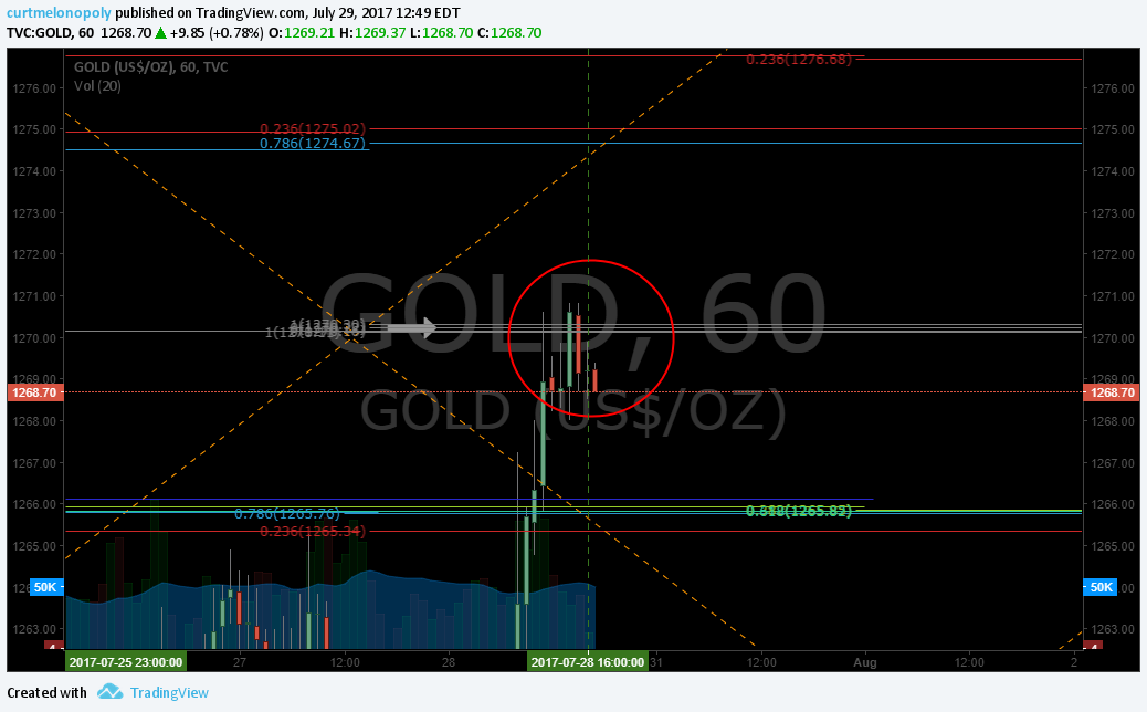
1: 60 min time cycle quadrants represented in orange diagonal dotted lines. These are critical to trade and you will find they will act as significant support and resistance decisions.
Also, 2: along with them are the horizontal grey lines – they, as with EPIC charting become significant support and resistance.
If you consider the seven indicators above plus the two below there are then nine indicators of support and resistance decisions that each will act as support and resistance in their own manner. This is where time, experience and training come in. Our lead trader will (as noted above) provide regular webinars / videos on the subject.
Although many inflections of trade occur within each quadrant, one of the main to consider is that price regularly moves toward the quadrant apex, inverse apex and either side apex. Also of importance is that trade often becomes more volatile when leaving / entering a quadrant and also as trade nears the middle (widest range) part of a quadrant.
Rosie the Gold Algorithm Chart Model with 60 Min Quadrants (orange dotted) July 9 1105 PM #Gold $GLD $GC_F $XAUUSD
https://www.tradingview.com/chart/GOLD/fKsoBHcc-Gold-algorithm-model-charting-60-min/

Our plan going forward is to provide low frame quadrant charting for our traders. We first want to provide training for the charting to date and give our traders a few weeks with this development. Expect regular training webinars to be announced over the coming days.
Also of note, we have a model for $GDX we will add to this report in the coming weeks.
For now, the obvious trade considering the quadrant above is for price to chase the lower inverse apex on the chart terminating July 18, 2017 at approximately 1184.00 on the chart (your attention should be given to the 1071.00 approximate figure below in the conventional charting). This is not however absolute. The regular reporting will keep you up to date with our bias considering model trade.
Your short term overhead resistance is 1220.29 (grey horizontal) and your support is 1204.79 (blue horizontal fib) and then of course the quadrant wall (diagonal orange dotted).
Wider range there is significant resistance at 1228.14 (blue) and significant support at 1185.58 (yellow). These are areas our traders take advantage of trade support and resistance (blue and yellow horizontal support and resistance). You will find these two indicators to provide your best ROI because of predictability. The quadrants add a dynamic that otherwise would not be there, but the wider time frame critical support and resistance are where a trader can size in considerably.
Below are some conventional Gold and $GDX charting considerations also for consideration and should be given weight to your trade.


https://www.tradingview.com/chart/XAUUSD/zNO98VFe-Will-basic-chart-history-in-Gold-repeat/


All the best with your trades and look forward to seeing you in the room!
Rosie the Gold Algo
Article Topics: Rosie, Gold, Algorithm, Algo, Chart, Trading, Chatroom, Gold, $XAUUSD, $GOLD, $GLD, $UGLD, $DGLD, Miners, $GDX, $NUGT, $DUST, $JDST, $JNUG

