
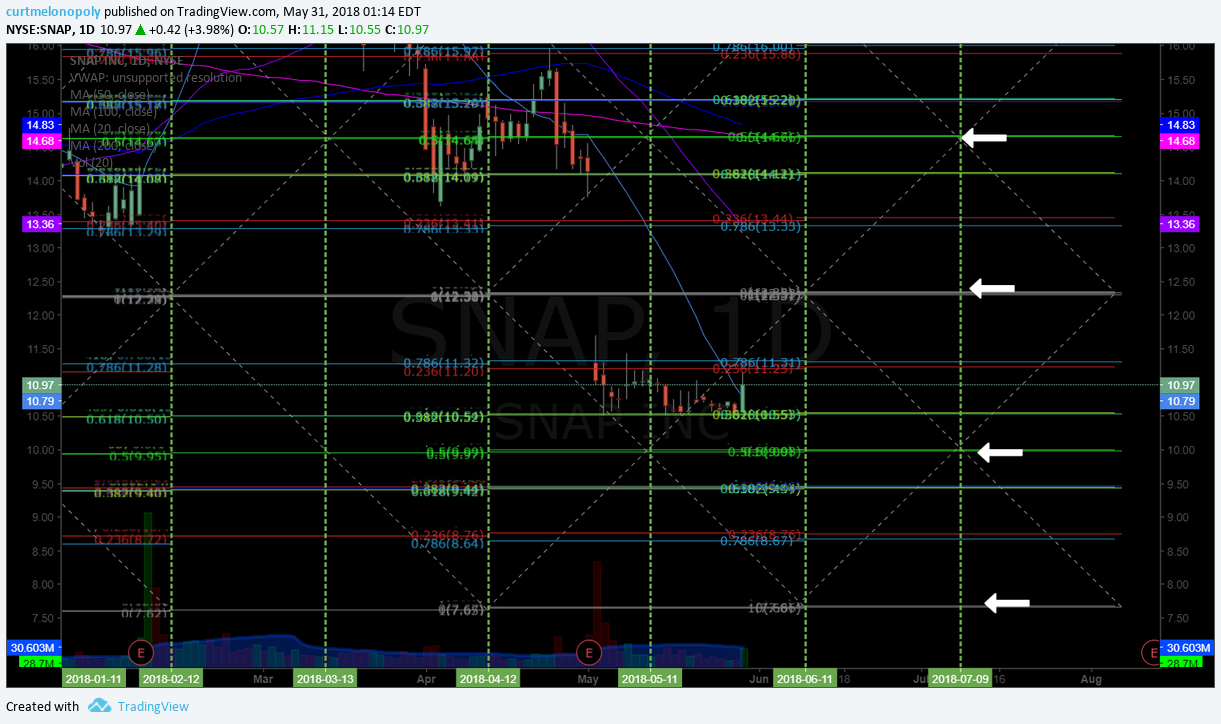
The SNAP chart is a disaster but it does look like a near term bottom area. Lots of caution of course.
The SNAP chart is a disaster but it does look like a near term bottom area. Lots of caution of course.
The SNAP chart is a disaster but it does look like a near term bottom area. Lots of caution of course.
The SNAP chart is a disaster but it does look like a near term bottom area. Lots of caution of course.